با سلام خدمت دوستان عزیزم با یکی دیگر از سری آموزشهای قدم به قدم با مونو در خدمت شما هستم.در مطلب گذشته با چند سری از کنترل های ورودی در زامارین آشنا شدیم و در این آموزش به ادامه مطلب گذشته می پردازیم.
-
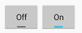
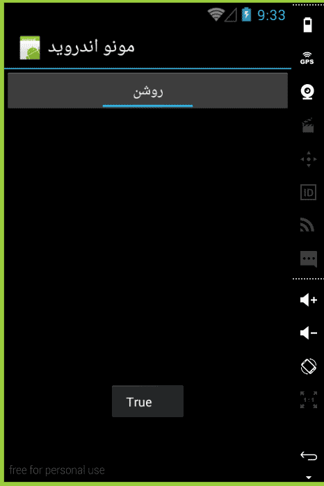
Switch
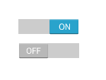
این کنترل می تواند بین دو حالت روشن یا خاموش تغییر حالت دهد که در حالت پیشفرض آن بر روی حالت خاموش قرار گرفته است این کنترل شامل دو متن در دو حالت خود است که میتوانید به نسبت کار خود آنها را تغییر دهید. به مثال زیر توجه فرمایید.
<?xml version="1.0" encoding="utf-8" ?>
<LinearLayout xmlns:android="http://schemas.android.com/apk/res/android"
android:orientation="vertical"
android:layout_width="fill_parent"
android:layout_height="fill_parent">
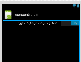
<Switch android:text="شما از سایت ما رضایت دارید"
android:layout_width="match_parent"
android:layout_height="wrap_content"
android:checked="true"
android:textOn="بله"
android:textOff="خیر"
android:id="@+id/switch1" />
</LinearLayout>
-
خصوصیات کنترل Switch
این کنترل شامل چهار خصوصیت مهم است که در زیر به آن اشاره خواهیم کرد
- android:text : این خصوصیت جهت نمایش متن یا همان لیبل این کنترل است .
- android:checked : این خصوصیت مقدار حالت فعلی را نمایش خواهد در حالت روشن مقدار True و در حالت خاموش مقدار False را نمایش خواهد داد.
- android:textOn : این خصوصیت متنی که در حالت روشن باید نمایش داده شود را تنظیم خواد کرد.
- android:textOff :این خصوصیت متنی که در حالت خاموش باید نمایش داده شود را تنظیم خواد کرد.
using Android.App;
using Android.Widget;
using Android.OS;

namespace mono
{
    [Activity(Label = "مونو اندروید", MainLauncher = true, Icon = "@drawable/icon")]
    public class MainActivity : Activity
    {
        protected override void OnCreate(Bundle bundle)
        {
            base.OnCreate(bundle);
            SetContentView(Resource.Layout.Main);
            var switchView = FindViewById<Switch>(Resource.Id.switch1);
            switchView.CheckedChange += switchView_CheckedChange;
        }
       void switchView_CheckedChange(object sender, CompoundButton.CheckedChangeEventArgs e)
        {
             /// نمایش پیغام به کاربر
             Toast.MakeText(this, e.IsChecked.ToString(), ToastLength.Long).Show();
        }
    }
 }
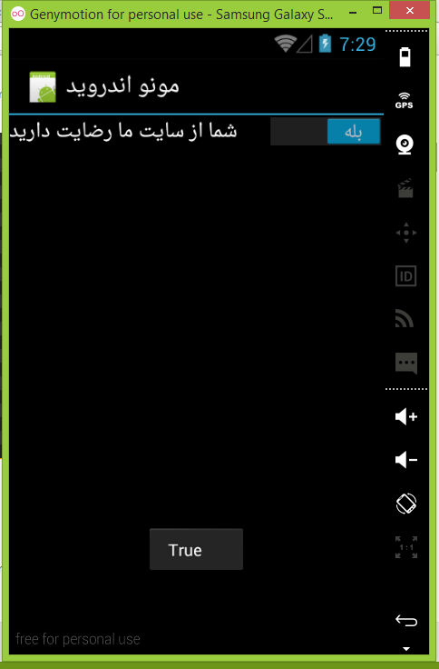
پس از اجرای کد بالا خروجی زیر را مشاهده خواهید کرد
-
رخداد کنترل Switch
یکی از مهمترین رخداد کنترل Switch رخداد CheckedChange است که در صورت تغییر حالت این کنترل اجرا خواهد شد .شاید شما در برنامه خودتان نیاز داشته باشد که در صورتی که کاربر حالت آن را تغییر داد پیغامی مناسب به کاربر نمایش دهید در مثال زیر نحوه استفاده از این رخ داد نمایش داده شده است .
دقت کنید پس از تغییر حالت کنترل حالت فعلی کنترل در CompoundButton.CheckedChangeEventArgs مقدار دهی خواهد شد که شما برای بدست آوردن حالت فعلی می توانید از این متغییر استفاده نمایید
-
CheckBox

کنترل CheckBox هم مثل کنترل Switch داری دو حالت انتخاب شده و انتخاب نشده است. این کنترل یکی از ابتدایی ترین کنترل ها در زمان ایجاد اندروید است ولی کنترل Switch از API 14 بوجود آمد و در لیست کنترل ها قرار داده شد .مقدار پیشفرض این کنترل در حالت انتخاب نشده است در مثال زیر نمونه ای از این کنترل را مشاهده می کنید .
<?xml version="1.0" encoding="utf-8" ?>
<LinearLayout xmlns:android="http://schemas.android.com/apk/res/android"
android:orientation="vertical"
android:layout_width="fill_parent"
android:layout_height="fill_parent"
android:minWidth="25px"
android:minHeight="25px">
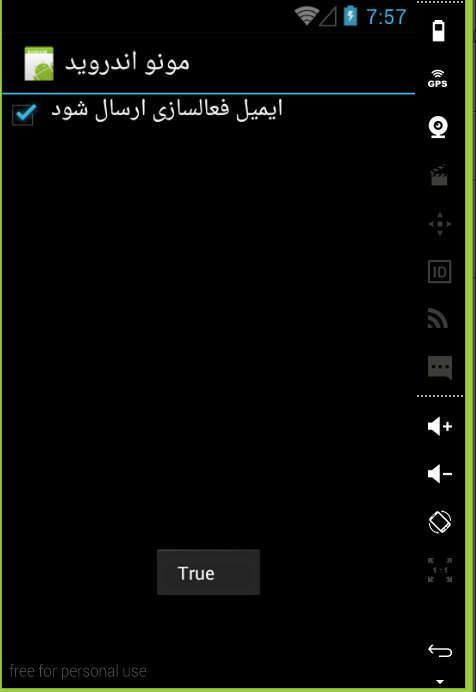
<CheckBox android:text="ایمیل فعالسازی ارسال شود"
android:layout_width="match_parent"
android:layout_height="wrap_content"
android:id="@+id/checkBox"
android:checked="false"
android:layout_gravity="right"
android:layoutDirection="rtl"
android:gravity="left" />
</LinearLayout>
-
خصوصیات کنترل CheckBox
این کنترل داری ۲ خصوصیت مهم است که در زیر به آن اشاره خواهیم کرد
- android:text : متن نمایش برای کنترل
- android:checked : این خصوصیت بسته به حالت کنترل مقدار True یا False خواهد گرفت و همینطور میتوانید با مقدار دهی ان حالت کنترل را تغییر دهید
-
رخداد کنترل CheckBox
این کنترل هم همانند کنترل Switch داری یک رخداد مهم به نام CheckedChange است که هنگام تغییر حالت کنترل اجرا خواهد شد
using Android.App;
using Android.Widget;
using Android.OS;

namespace mono
{
    [Activity(Label = "مونو اندروید", MainLauncher = true, Icon = "@drawable/icon")]
    public class MainActivity : Activity
    {
        protected override void OnCreate(Bundle bundle)
        {
            base.OnCreate(bundle);
            SetContentView(Resource.Layout.Main);
            var checkBox = FindViewById<CheckBox>(Resource.Id.checkBox);
            checkBox.CheckedChange += checkBox_CheckedChange;
        }
       void checkBox_CheckedChange(object sender, CompoundButton.CheckedChangeEventArgs e)
        {
           Toast.MakeText(this, e.IsChecked.ToString(), ToastLength.Long).Show();
        }
    }
 }
-
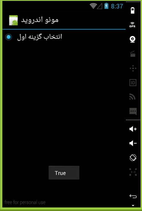
RadioButton
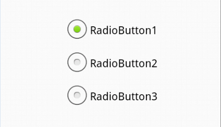
این کنترل هم همانند دو کنترل قبل دارای دو حالت انتخاب شده و انتخاب نشده است . در حالت پبشفرص بر روی حالت انتخاب نشده قرار دارد. در مثال زیر نحوه استفاده از این کنترل نمایش داده شده است.
فرق بین کنترل Checkbox و RadioButton در این است که در طراحی ها زمانی که از چند Checkbox در برنامه هایتان استفاده می کنید کاربر قادر به انتخاب هیچ یا همه کنترل ها خواهد بود ولی در کنترل RadioButton به اینصورت نخواهد بود و کاربر فقط یکی از کنترل ها را می تواند انتخاب نمایید برای پیاده سازی این اصل باید کنترل های RadioButton را در یک RadioButtonGroup قرار دهید در این صورت کاربر می تواند همه کنترل های RadioButton را انتخاب کند و وقتی انتخاب کرد دیگر نمی تواند از حالت انتخاب خارج نماید لطفا در طراحی ها توجه نمایید.
<?xml version="1.0" encoding="utf-8" ?>
<LinearLayout xmlns:android="http://schemas.android.com/apk/res/android"
              android:orientation="vertical"
              android:layout_width="fill_parent"
              android:layout_height="fill_parent"
              android:minWidth="25px"
              android:minHeight="25px">
    <RadioButton android:text="انتخاب گزینه اول"
                 android:layout_width="match_parent"
                 android:layout_height="wrap_content"
                 android:id="@+id/radioButton" />
</LinearLayout>
-
خصوصیات کنترل RadioButton
این کنترل هم همانند کنترل قبلی دارای دو خصوصیت مهم است که در زیر به آن اشاره شده است
- android:text : متن نمایش برای کنترل
- android:checked : این خصوصیت بسته به حالت کنترل مقدار True یا False خواهد گرفت و همینطور میتوانید با مقدار دهی ان حالت کنترل را تغییر دهید
-
رخداد کنترل RadioButton
این کنترل هم همانند کنترل checkBox داری یک رخداد مهم به نام CheckedChange است که هنگام تغییر حالت کنترل اجرا خواهد شد. به مثال زیر توجه نمایید
using Android.App;
using Android.Widget;
using Android.OS;

namespace mono
{
    [Activity(Label = "مونو اندروید", MainLauncher = true, Icon = "@drawable/icon")]
    public class MainActivity : Activity
    {
        protected override void OnCreate(Bundle bundle)
        {
            base.OnCreate(bundle);
            SetContentView(Resource.Layout.Main);
            var radioButton = FindViewById<RadioButton>(Resource.Id.radioButton);
            radioButton.CheckedChange += radioButton_CheckedChange;
        }
       void radioButton_CheckedChange(object sender, CompoundButton.CheckedChangeEventArgs e)
       {
           Toast.MakeText(this, e.IsChecked.ToString(), ToastLength.Long).Show();
       }
    }
}
-
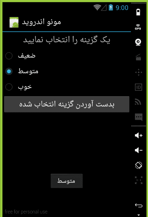
RadioButtonGroup
همانطور که از اسم این کنترل پیداست در بر دارنده چندین کنترل RadioButton است که کاربر مجاز به انتخاب یکی از آنهاست مثال زیر نمونه ای از استفاده این کنترل است این کنترل داری یک خصوصیت مهم به اسم CheckedRadioButtonId است که ایدی کنترل انتخاب شده را بر می گرداند و شما با استفاده از این خصوصیت می توانید کنترل انتخاب شده را بدست آورید به مثال زیر توجه نمایید.
<?xml version="1.0" encoding="utf-8" ?>
    <LinearLayout xmlns:android="http://schemas.android.com/apk/res/android"
                  android:orientation="vertical"
                  android:layout_width="fill_parent"
                  android:layout_height="fill_parent"
                  android:minWidth="25px"
                  android:minHeight="25px">
        <TextView android:text="یک گزینه را انتخاب نمایید"
                  android:layout_width="match_parent"
                  android:layout_height="40dp"
                  android:id="@+id/radioButton"
                  android:textSize="20dp"
                  android:layout_gravity="center_horizontal"
                  android:gravity="center_vertical|center" />
        <RadioGroup android:minWidth="25px"
                    android:minHeight="25px"
                    android:layout_width="match_parent"
                    android:layout_height="wrap_content"
                    android:id="@+id/myRadioGroup">
            <RadioButton android:layout_width="wrap_content"
                         android:layout_height="wrap_content"
                         android:checked="true"
                         android:text="ضعیف"
                         android:id="@+id/radioButton1" />
            <RadioButton android:layout_width="wrap_content"
                         android:layout_height="wrap_content"
                         android:text="متوسط"
                         android:id="@+id/radioButton2" />
            <RadioButton android:layout_width="wrap_content"
                         android:layout_height="wrap_content"
                         android:text="خوب"
                         android:id="@+id/radioButton3" />
        </RadioGroup>
        <Button android:text="بدست آوردن گزینه انتخاب شده"
                android:layout_width="match_parent"
                android:layout_height="wrap_content"
                android:id="@+id/button1" />
    </LinearLayout>
using Android.App;
    using Android.Widget;
    using Android.OS;

    namespace mono
    {
       [Activity(Label = "مونو اندروید", MainLauncher = true, Icon = "@drawable/icon")]
       public class MainActivity : Activity
       {
         protected override void OnCreate(Bundle bundle)
          {
             base.OnCreate(bundle);
             SetContentView(Resource.Layout.Main);
             var button = FindViewById<Button>  (Resource.Id.button1);
             button.Click += button_Click;
         }
        void button_Click(object sender, System.EventArgs e)
        {
            var radioButtonGroup = FindViewById<RadioGroup>(Resource.Id.myRadioGroup);
            int selectedRadioButtonId = radioButtonGroup.CheckedRadioButtonId;
            var selectedRadioButton = FindViewById<RadioButton>(selectedRadioButtonId);
                Toast.MakeText(this, selectedRadioButton.Text, ToastLength.Long).Show();
         }
      }
   }
-
ToggleButton
این کنترل همانند یک کنترل Button در اندروید است با این تفاوت که دارای دو حالت انتخاب شده و انتخاب نشده است و با هر بار کلیک بر روی آن حالت آن عوض می شود به مثال زیر توجه نمایید.
<?xml version="1.0" encoding="utf-8" ?>
<LinearLayout xmlns:android="http://schemas.android.com/apk/res/android"
              android:orientation="vertical"
              android:layout_width="fill_parent"
              android:layout_height="fill_parent"
              android:minWidth="25px"
              android:minHeight="25px">
    <ToggleButton android:layout_width="match_parent"
                  android:layout_height="wrap_content"
                  android:id="@+id/myToggleButton" />
</LinearLayout>
using Android.App;
using Android.Widget;
using Android.OS;

namespace mono
{
    [Activity(Label = "مونو اندروید", MainLauncher = true, Icon = "@drawable/icon")]
    public class MainActivity : Activity
    {
        protected override void OnCreate(Bundle bundle)
        {
            base.OnCreate(bundle);
            SetContentView(Resource.Layout.Main);
            var toggleButton = FindViewById<ToggleButton>(Resource.Id.myToggleButton);
            toggleButton.CheckedChange += toggleButton_CheckedChange;
        }
       void toggleButton_CheckedChange(object sender, CompoundButton.CheckedChangeEventArgs e)
       {
            Toast.MakeText(this, e.IsChecked.ToString(), ToastLength.Long).Show();
       }
    }
}
به پایان یکی دیگر از سری آموزشهای قدم به قدم با مونو رسیدیم امیدوارم از آموزش ها راضی باشین همچنین منتظر انتقادات و پیشنهادات شما هستم
- ۱۹ آذر ۱۳۹۴ ۰۱:۰۹
- 0
- محمدزاده
- قدم به قدم با مونو
- 2,643 بازدید